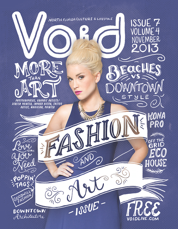
 In this magazine the font compliments what the magazine is about by having font which is art and creative like the magazines content. The title of the magazine is big and bold but still creative and arty.
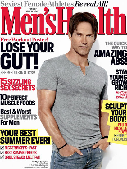
This magazines font has the title in big bold serif font which shows its more modern but the 'LOSE YOUR GUT!' title is in sans. The smaller font is the titles of the content included in the magazine.

In this magazine the title 'ROLL STEP' is in a cartoon writing meaning it could be targeting a certain audience. The headline 'Direct the way' is in serif writing. The small headlines are in sans text.
No comments:
Post a Comment